Photos August FSC- SR Harris

Here are some photos from yesterday’s SR Harris Fashion Sewing Club. It was a great day! Stay tuned for photos from Tuesday & Saturday FSC at Treadle.

Cutting Line pants pattern

McCalls 3136

New Look 6495

Kwik Sew 4221

Style Arc Josie Top

Simplicity 1318

Pillowcase dresses

McCalls 6944

Power color

One easy way to look vibrant and healthy is wearing the color teal (blue-green). It’s a magical color that is universally flattering on all skin types.

As we learn in art class, colors opposite each other on the color wheel are called complementary colors. When placing complementary colors together, each color looks brighter and naturally good together.

Skin coloring, can be applied to the color wheel too. As you can see, it falls into the red-orange family. Now, if you look directly across the color wheel. What color do you see?…VOILA!…It’s teal! Teal is a complimentary color of red-orange. And since virtually all skin types are in the red-orange family, teal is incredibly flattering to wear.

The other magical property of teal is its flattering range in color value and intensity. It’s hard to find a variation of teal that doesn’t look good on people. To illustrate this point, I took the same teal fabric and draped it on four different people. Each of us has unique coloring (warm, cool, and neutral) and you can see the same shade of teal looks great on all of us. (**This works for people of color as well as caucasian skin tone**)

Since Kristin was absent during our photo shoot. Here is a photo of her wearing a different shade of teal. Doesn’t she look great?

Next time you grab something to wear, grab a little teal. It’s a magical color.

Thanks for stopping by!

Katie

Pinners Conference

The Pinners Conference made its way through downtown Minneapolis this weekend. Lots of DIY activities, products and even a few familiar faces popped up. It was good to see a Pinterest inspired event drawing lots of young DIY enthusiasts. Check out some photos below.

Thanks for stopping by!

Katie

Simple Trick

When getting dressed each morning, wearing something as dark as my hair helps me look better. It’s a simple trick that can improve any outfit. Take a look and see what a difference adding a medium dark (hair color) accessory makes in my overall appearance.

When I’m out and about, guess what color accessories I’ll be sporting—-medium dark brown, just like my hair color.

Thanks for stopping by!

Katie

Value Contrast

Next time you rummage through your closet looking for something to wear, keep your personal value contrast in mind.

Value contrast plays an important role in looking our best. When a person and their clothing appear equal or within their value contrast, magic happens.

To determine value contrast, the first step is to to take a black and white photo.

Next, plot hair and skin values on the grayscale.

Comparing the photo to the grayscale determines my hair is around a level 3 and skin level 8. The difference between these is 5 levels. My value contrast is classified as medium-high.

Why does value contrast matter? Staying inside a person’s contrast range allows the PERSON to shine. On the contrary, when clothing is too high in contrast, the person FADES into the background.

Take a look at the photos below to see what a difference the right contrast makes. The first set of photos shows too high of contrast, the second set is just right.

Personal value contrast is unique to each of us. Debbie, Kristin, and I have determined our individual value contrast. We’re attempting to elevate our fashion sewing choices with this knowledge. We invite you to explore yours and share your journey too.

Thanks for reading! —Katie

Maximize Impact Through Color Value

For those of you who may have missed the news, Kristin and I are now certified color analysts. We spent a week in Dallas studying with Elaine Stoltz, a master of image and color consulting.

Through the process, we learned more than just how to choose flattering colors. We learned how to identify personal value and its impact on how we look.

Let’s take a look at value, an easy way to identify it, and how to use these concepts to look better.

VALUE
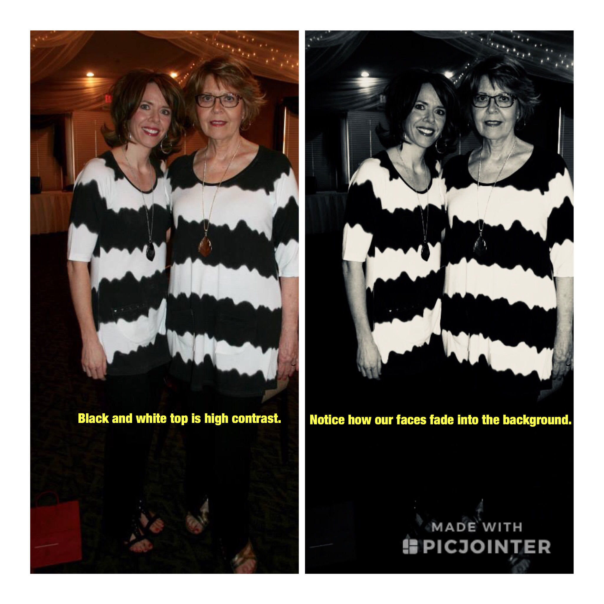
A color’s value is defined as the lightness or darkness of a color. Black is the darkest, and white is the lightest. Value is measured by a grey scale.

Human hair and skin values can be applied to the grey scale. Simply take a black and white photograph of yourself and compare it. In the photo below (makeup free) it’s obvious that Kristin and I have different values. My hair is much darker. Surprisingly, my skin is slightly darker in value when compared to hers, too. Because hair is dominant, my OVERALL VALUE is classified as medium dark. Kristin’s OVERALL VALUE is medium.

You may be asking, why should I care?

My answer is this— if you want to look your best, incoporate your OVERALL VALUE somewhere in your outfit.

For example, here’s an outfit modeled at Fashion Sewing Club (see photo below). Although flattering, the colors are too light in value. The black and white photo reveals my hair is much darker in value than my clothing.

I can still wear this outfit, but next time will add accessories in my overall value: brown wooden jewelry, a darker bag, and belt are great options to “connect” my clothing with my head.

When dressing, repeat your overall value in your outfit. It makes a difference.

Katie

Color Training

Exciting news in the Material Girls’ World! This week, Kristin and I are training to become certified color analysts.

Long gone are the days of the four season color plan. The majority of people don’t fit strictly into these categories. Many are a combination of cool and warm. A nuanced approach is often necessary when taking personal color contrast into account. It’s not uncommon for an ideal color to change as a person ages. These are some reasons why Kristin and I want to add this service to our toolbox.

My color journey began with Nancy Nix-Rice, a certified consultant from St. Louis. She identified tones in my skin, eyes, and hair and provided a custom color palette to enhance my personal coloring. I was blown away by the impact for the following reasons:

1. I look so much better! People have noticed that I sparkle and look younger when wearing my ideal colors.

2. Shopping for fabric is streamlined. Focusing on fabric ideal for me saves time. I simply bypass numerous gorgeous bolts better suited for someone of different coloring.

3. Use of a color palette increases my ability to mix and match successfully. When the color palette is based on innate personal coloring, wardrobe pieces go together.

My color journey has convinced me that no matter how cute the pattern, or how well its sewn, I’ll always look best when sewing my personal best colors.

We know how great it feels to love what we sew. Our goal is that you’ll love your results too.

Ruffles for Every Body!

Some trends, like clockwork, signal the change in season. It seems like each year ruffles mark the start of Spring. And this year, the story remains the same. Whether you cascade them from shoulders or spiral them off hips, ruffles/flounces create a soft, feminine look that can make you look fashionable. The tricky part is that they add volume, so placement is key. Let’s take a look at how ruffles/flounces can be successfully used on three body types.

1. Pear Figure

Pear figures have proportionally larger bottoms than tops. Adding ruffles/flounces to the upper body balances the figure and draws attention to the face. Take a look at New Look 6507. This asymmetric ruffled neckline works well. Similarly, the strong shoulder line of Burda 6429 offsets a larger hip nicely.

2. Inverted Triangle Figure

The opposite of the pear shape is the inverted triangle. The defining feature is narrower hips than shoulders. In order to look more proportionate, volume is needed on the lower body. Adding ruffles and flounces to skirts and shorts is one way for the inverted triangle to look proportionate. Consider McCalls 7287 and Simplicity 8606 as great options.

3. Oval Shape Figure

Typical characteristics of an oval figure are narrow hips and an undefined waist/midsection, which is often the largest measurement. The goal of the oval is to de-emphasize the midsection while defining a smaller area, which is often right under the bust, and elongating wherever possible. Subtlety is recommended for ovals embracing the ruffle trend. Strategic placement and drapey fabrics are key. The oval should consider subtle overlays, drapes, and flounces as a more flattering alternative and use them in elongating angles to maximize their look (see beautiful evening gown above).

Butterick 6396 (View A) features a flattering flounce. Try Pamela’s Patterns Draped Front Cardigan for very soft, subtle fullness at the wrist and hem.

No matter what your body type, Spring into the season wear fashionable flounces and ruffles.