FSC This Week!

Fashion Sewing Club starts again this week: Tues. 10:30a &6:30p at Treadle, Thurs. 10:30a at SR Harris in Burnsville. We’d love to see you there!

Here’s some pics from August club. Enjoy.

Burda #118 Sixties A-line Dress
Burda #113 Bow Dress
Burda #110 Batwing dress
Burda #110 Batwing Dress
McCalls 7200
Morris Blazer
New Look 6428
Christine Jonson Moto Jacket
Jalie 2806
Simplicity 8635
Simplicity 8635
Simplicity 8380

Fashion Sewing Club Treadle Pics

Happy Monday everyone! Some fabulous snapshots from last week’s FSC at Treadle Yard Goods. Enjoy!

Tunic Bible

Gift for friend

The Sewing Workshop Helix tee

Butterick 6188
Style Arc Elle pant

Designer inspired DIY knockoff
Vogue 8750
Vogue 9057
The Sewing Workshop downloadable tee
Pajamas for son
Sewing Workshop Eureka top

Photos August FSC- SR Harris

Here are some photos from yesterday’s SR Harris Fashion Sewing Club. It was a great day! Stay tuned for photos from Tuesday & Saturday FSC at Treadle.

Cutting Line pants pattern

McCalls 3136

New Look 6495

Kwik Sew 4221

Style Arc Josie Top

Simplicity 1318

Pillowcase dresses

McCalls 6944

Power color

One easy way to look vibrant and healthy is wearing the color teal (blue-green). It’s a magical color that is universally flattering on all skin types.

As we learn in art class, colors opposite each other on the color wheel are called complementary colors. When placing complementary colors together, each color looks brighter and naturally good together.

Skin coloring, can be applied to the color wheel too. As you can see, it falls into the red-orange family. Now, if you look directly across the color wheel. What color do you see?…VOILA!…It’s teal! Teal is a complimentary color of red-orange. And since virtually all skin types are in the red-orange family, teal is incredibly flattering to wear.

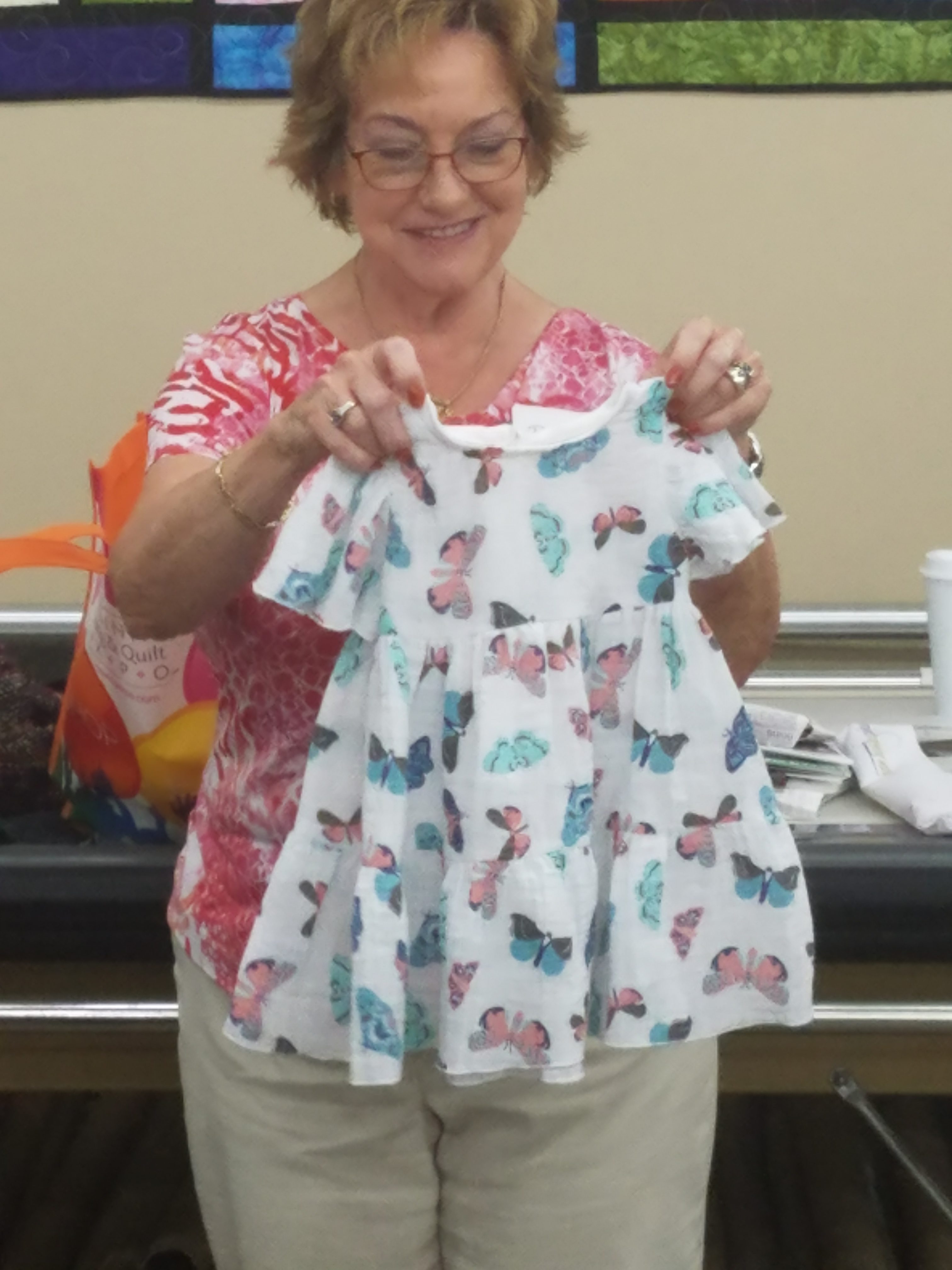
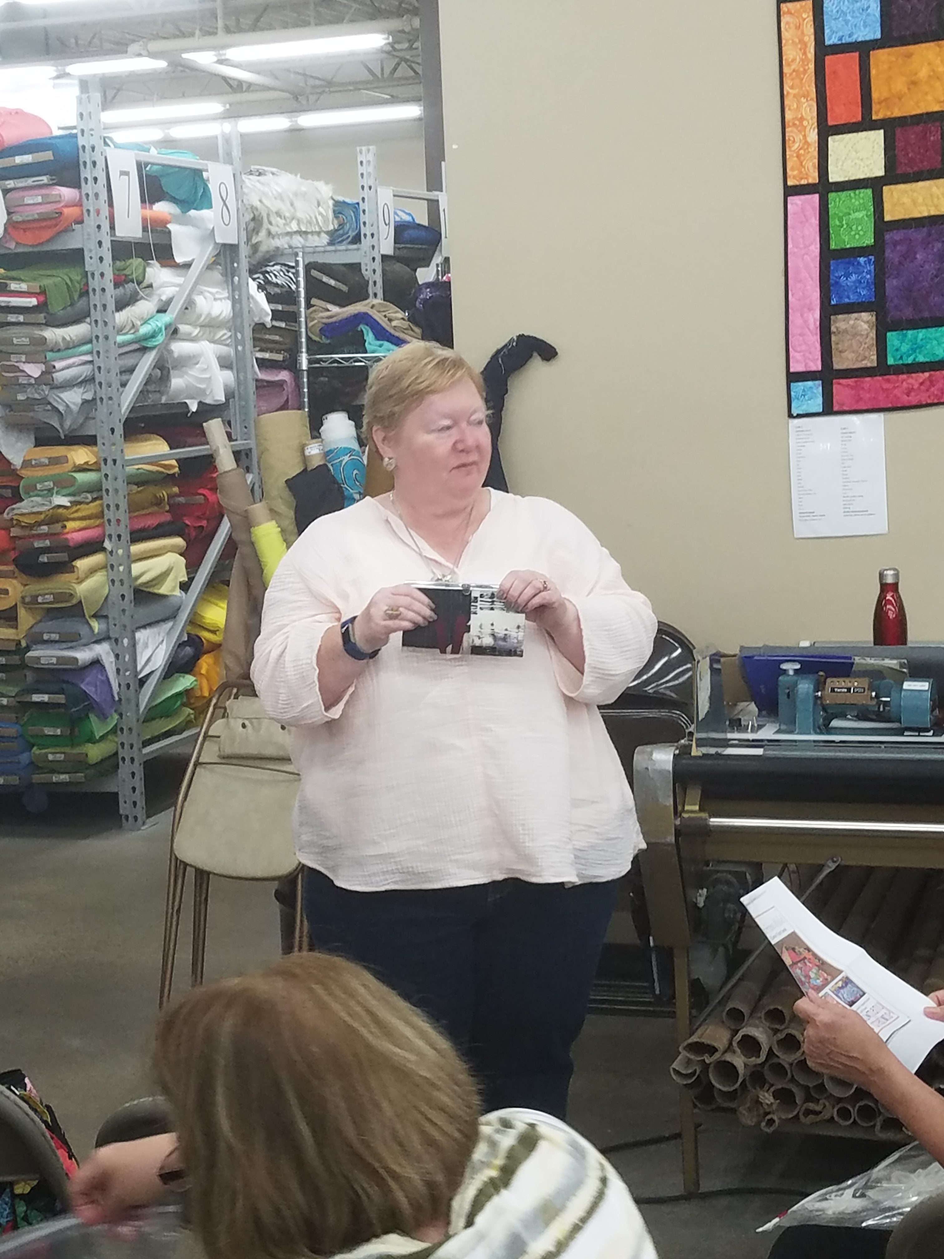
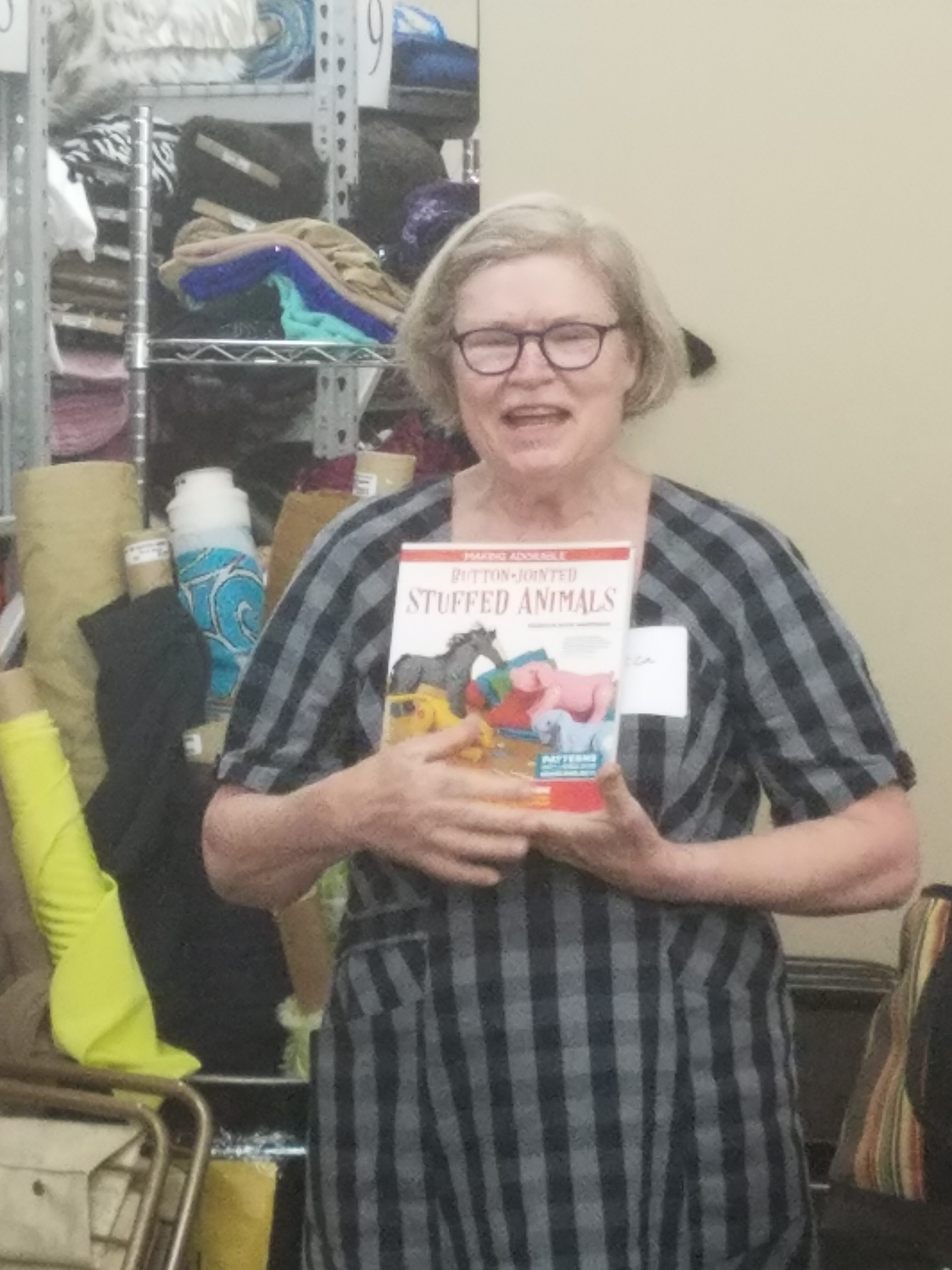
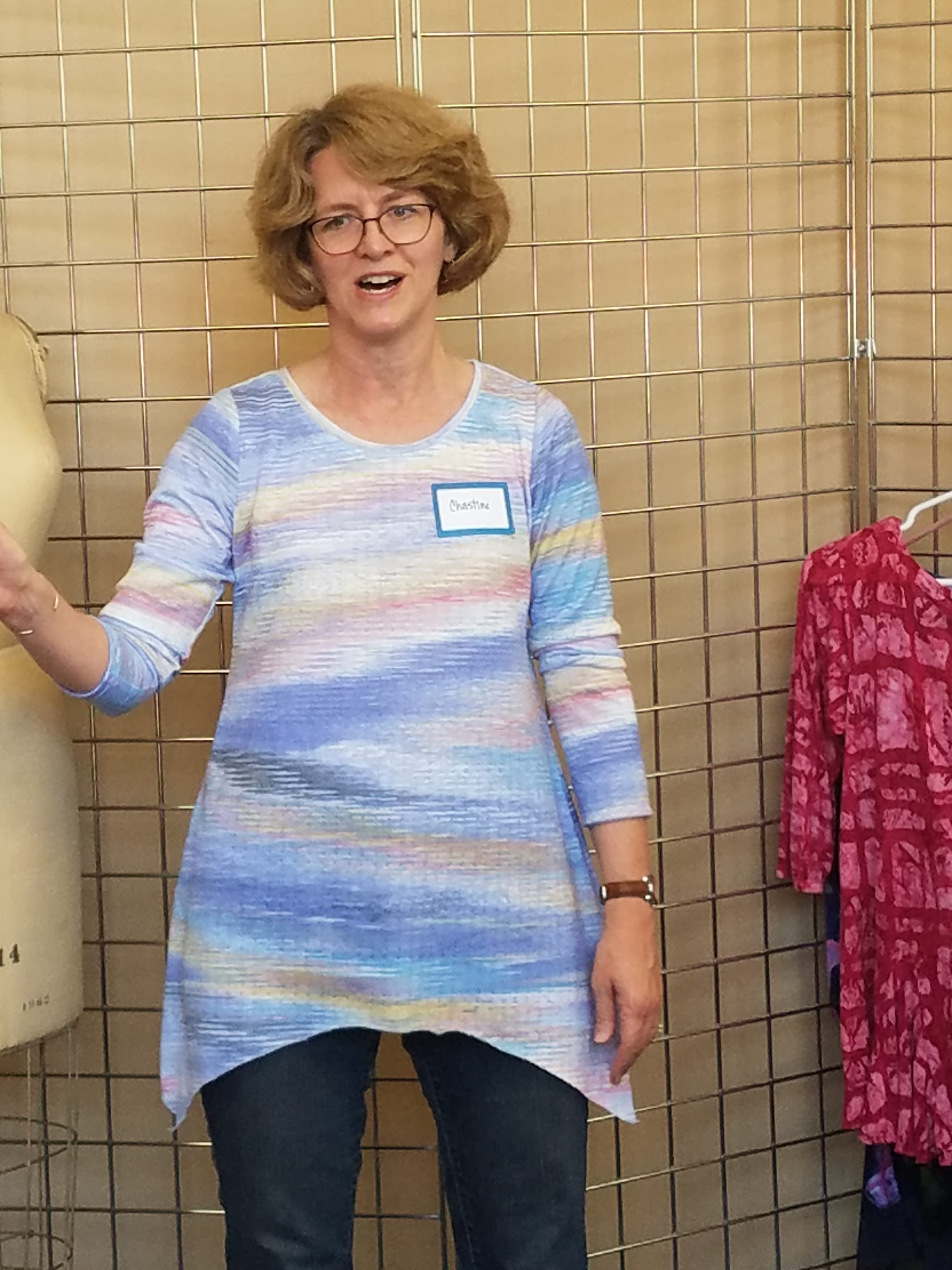
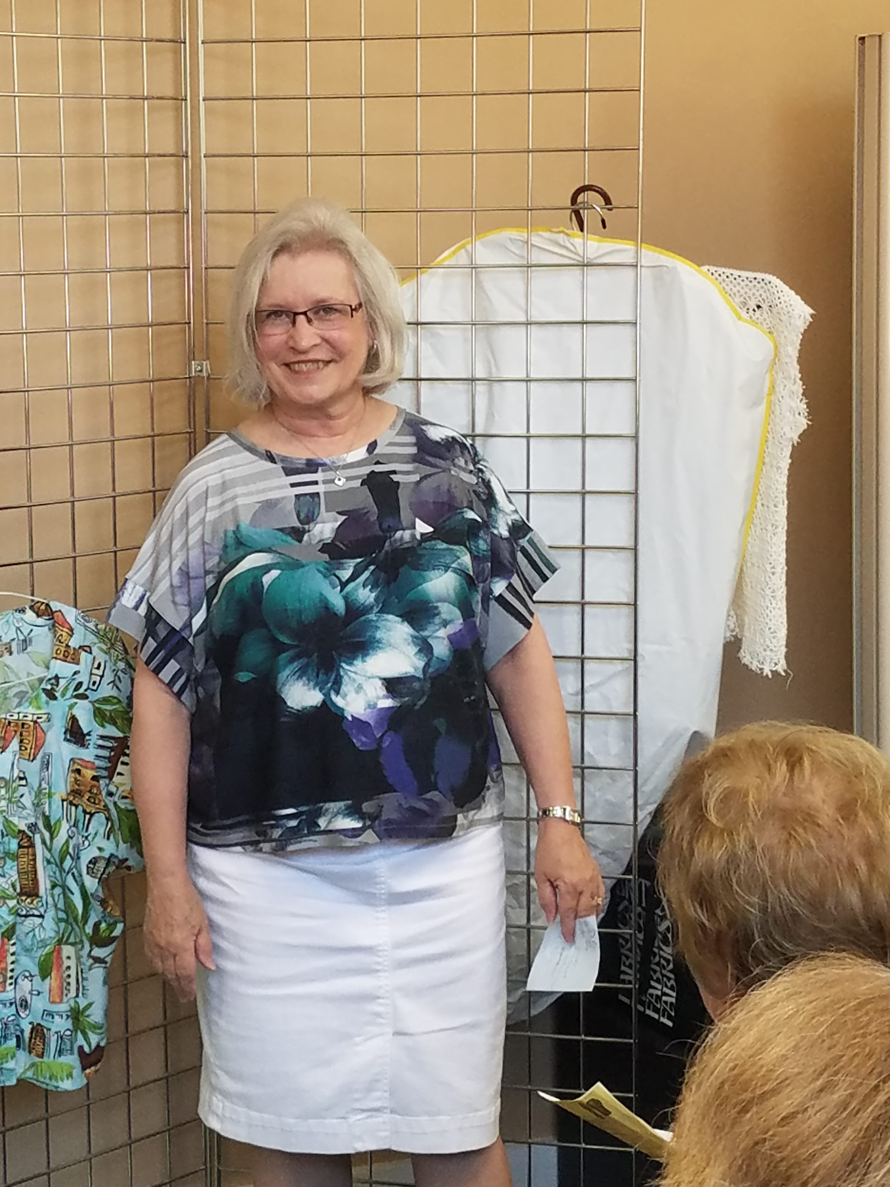
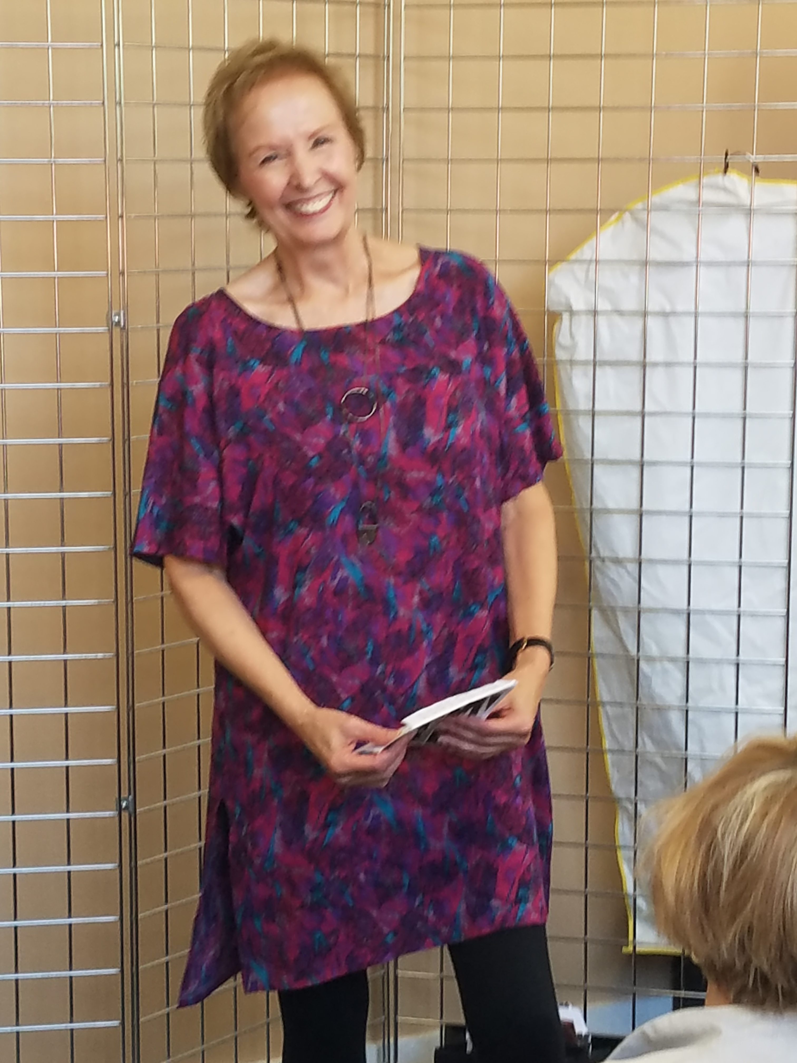
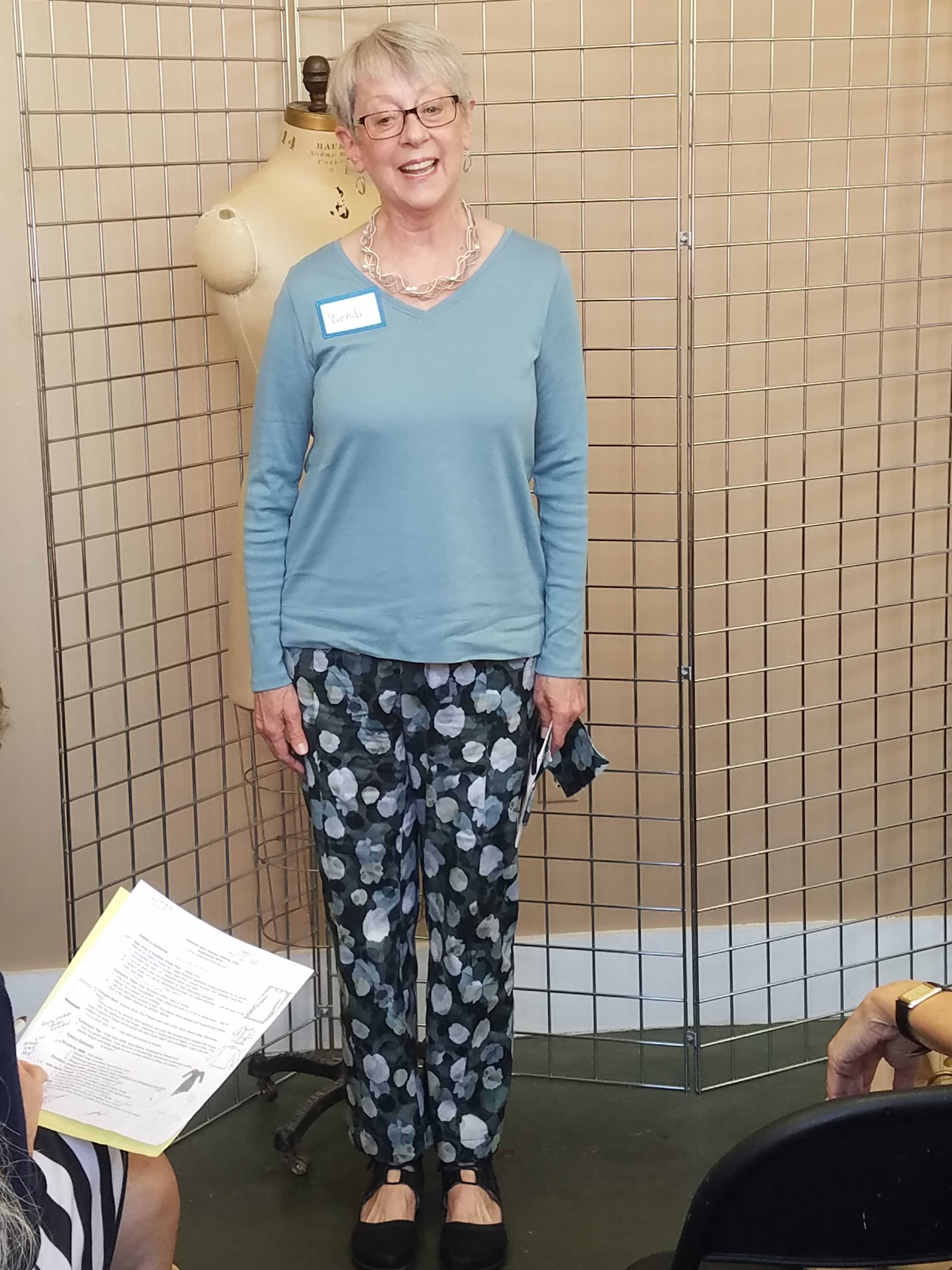
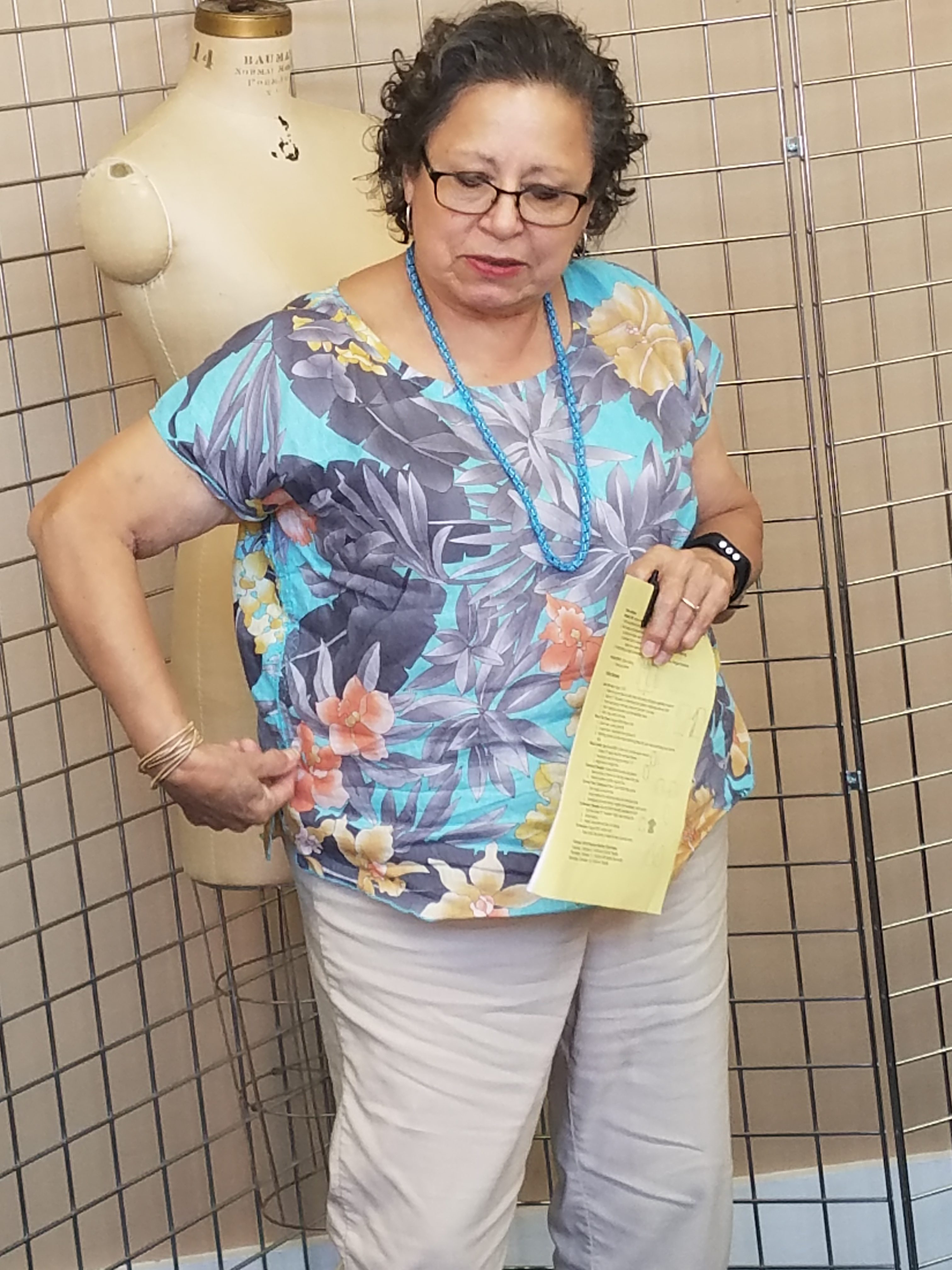
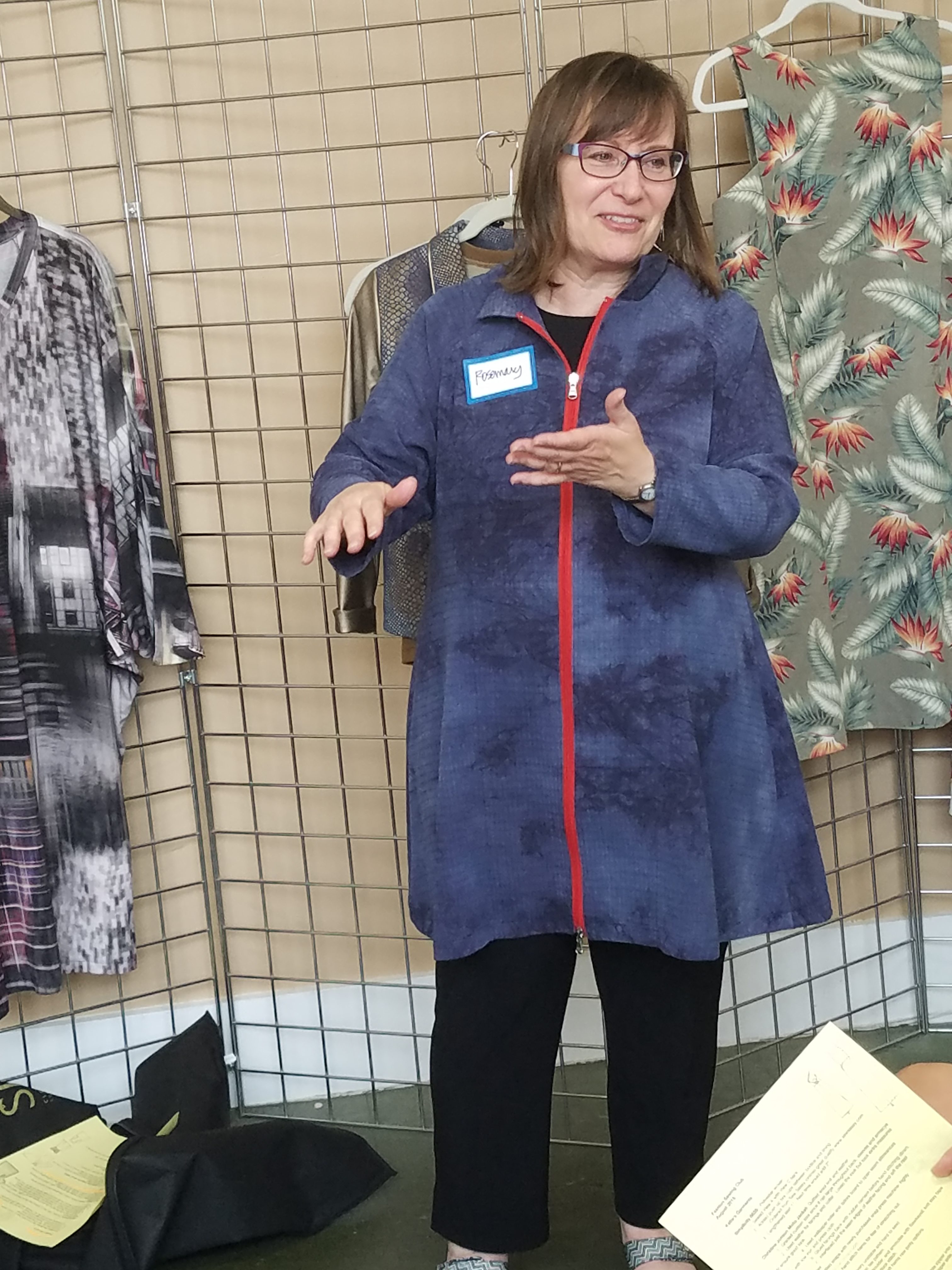
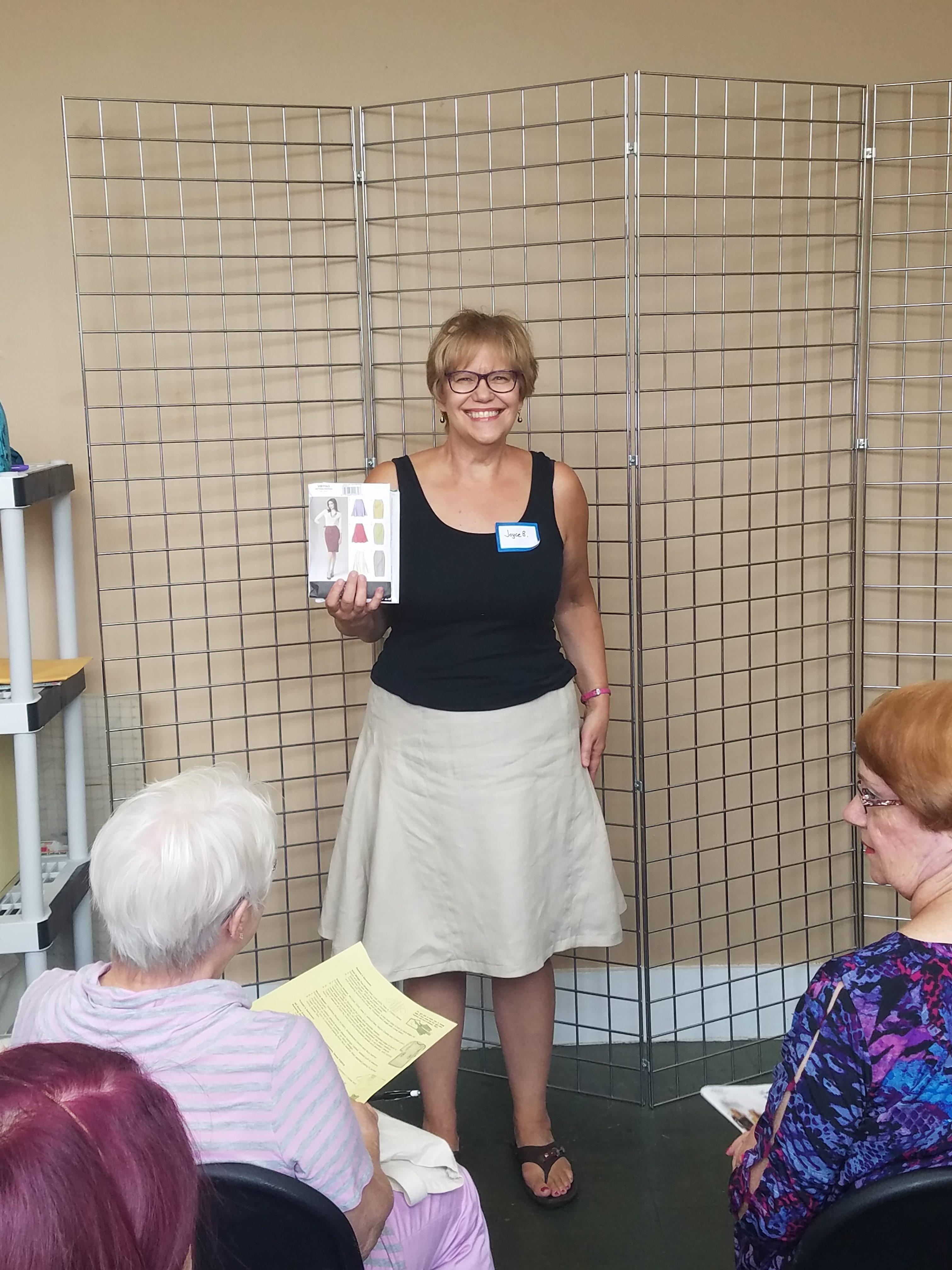
The other magical property of teal is its flattering range in color value and intensity. It’s hard to find a variation of teal that doesn’t look good on people. To illustrate this point, I took the same teal fabric and draped it on four different people. Each of us has unique coloring (warm, cool, and neutral) and you can see the same shade of teal looks great on all of us. (**This works for people of color as well as caucasian skin tone**)

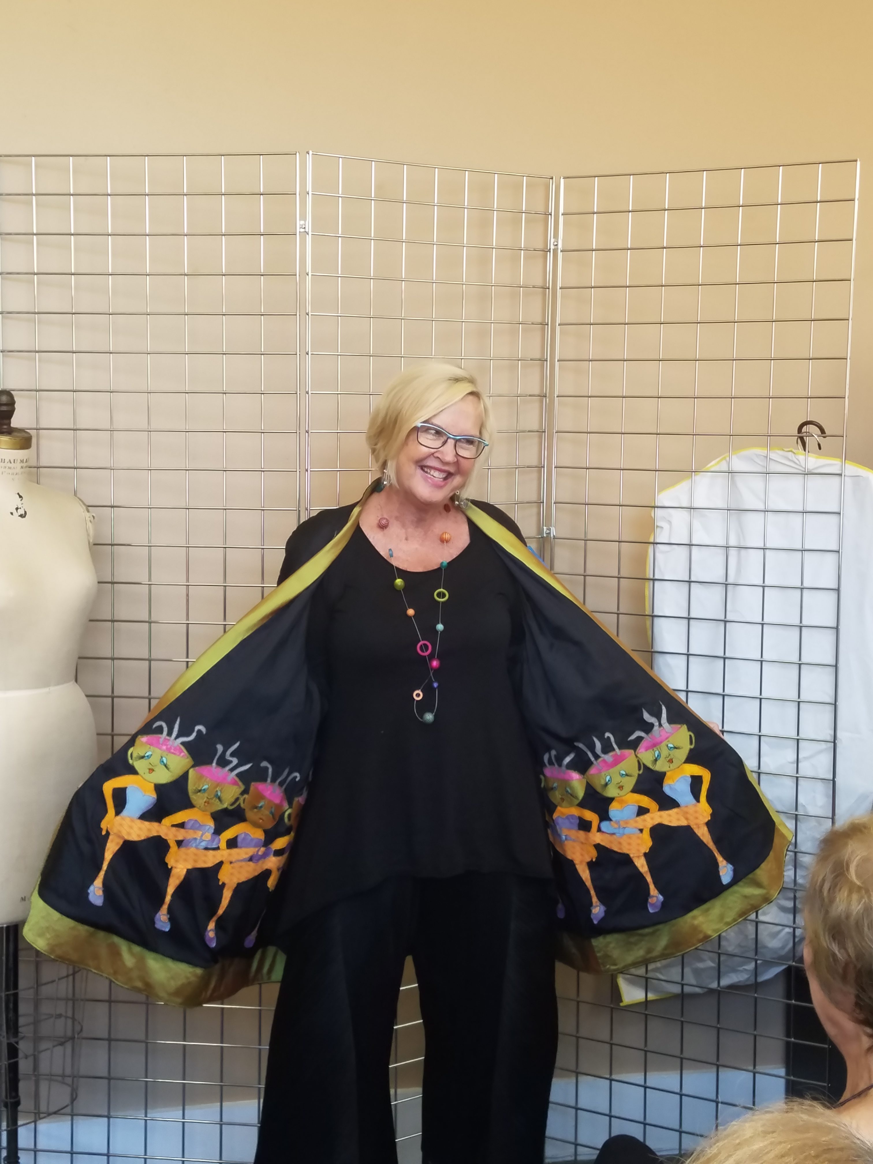
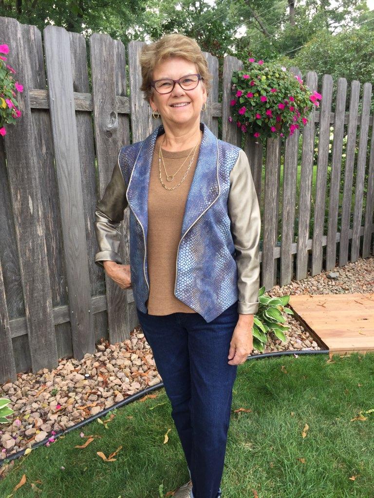
Since Kristin was absent during our photo shoot. Here is a photo of her wearing a different shade of teal. Doesn’t she look great?

Next time you grab something to wear, grab a little teal. It’s a magical color.

Thanks for stopping by!

Katie

Pinners Conference

The Pinners Conference made its way through downtown Minneapolis this weekend. Lots of DIY activities, products and even a few familiar faces popped up. It was good to see a Pinterest inspired event drawing lots of young DIY enthusiasts. Check out some photos below.

Thanks for stopping by!

Katie

Simple Trick

When getting dressed each morning, wearing something as dark as my hair helps me look better. It’s a simple trick that can improve any outfit. Take a look and see what a difference adding a medium dark (hair color) accessory makes in my overall appearance.

When I’m out and about, guess what color accessories I’ll be sporting—-medium dark brown, just like my hair color.

Thanks for stopping by!

Katie

Sneak Peek of June Fashion Sewing Club

Here’s a peek at what we’re sewing-what’s on your cutting table?

Well, call me technologically challenged but it’s a video sneak peek and Facebook is the only venue (?) that will let me upload it. So you’ll have to go to this link to see the video-and don’t worry, it’s only 2 minutes long 🙂

Must be super hi definition, huh?

Maybe I should stick to sewing…

Value Contrast

Next time you rummage through your closet looking for something to wear, keep your personal value contrast in mind.

Value contrast plays an important role in looking our best. When a person and their clothing appear equal or within their value contrast, magic happens.

To determine value contrast, the first step is to to take a black and white photo.

Next, plot hair and skin values on the grayscale.

Comparing the photo to the grayscale determines my hair is around a level 3 and skin level 8. The difference between these is 5 levels. My value contrast is classified as medium-high.

Why does value contrast matter? Staying inside a person’s contrast range allows the PERSON to shine. On the contrary, when clothing is too high in contrast, the person FADES into the background.

Take a look at the photos below to see what a difference the right contrast makes. The first set of photos shows too high of contrast, the second set is just right.

Personal value contrast is unique to each of us. Debbie, Kristin, and I have determined our individual value contrast. We’re attempting to elevate our fashion sewing choices with this knowledge. We invite you to explore yours and share your journey too.

Thanks for reading! —Katie